Short-form ads don’t fail because your product is boring. They fail because the message is messy.
Most teams try to cram everything into 20 seconds: brand story, features, proof, offer, CTA, and “vibe.” The result is a video that feels busy, unclear, and easy to skip.
The fix is structure.
At Pixelplot, we build Snackable Ads using a simple framework: four scenes, five seconds each. It’s fast to produce, easy to iterate, and designed for the way people actually watch TikTok, Reels, Shorts, and Stories.
In this guide, you’ll learn the exact 4-scene formula, what each scene should say, and templates you can copy to script your next batch of creatives.
What “Snackable” Means (and Why It Works)
A “snackable ad” is a short-form vertical creative designed for mobile-first attention.
In Pixelplot terms, snackable means:
- 20 seconds total
- Vertical 9:16
- Built from 4 scenes
- Each scene lasts 5 seconds
That constraint is the point. It forces clarity.
Instead of “make a video,” you’re executing a repeatable system:
- Win attention fast
- Make the product obvious
- Make the next step obvious
- Optionally stamp the brand
And because it’s modular, you can improve performance without starting over. You don’t rewrite the entire ad—you tweak one scene at a time.
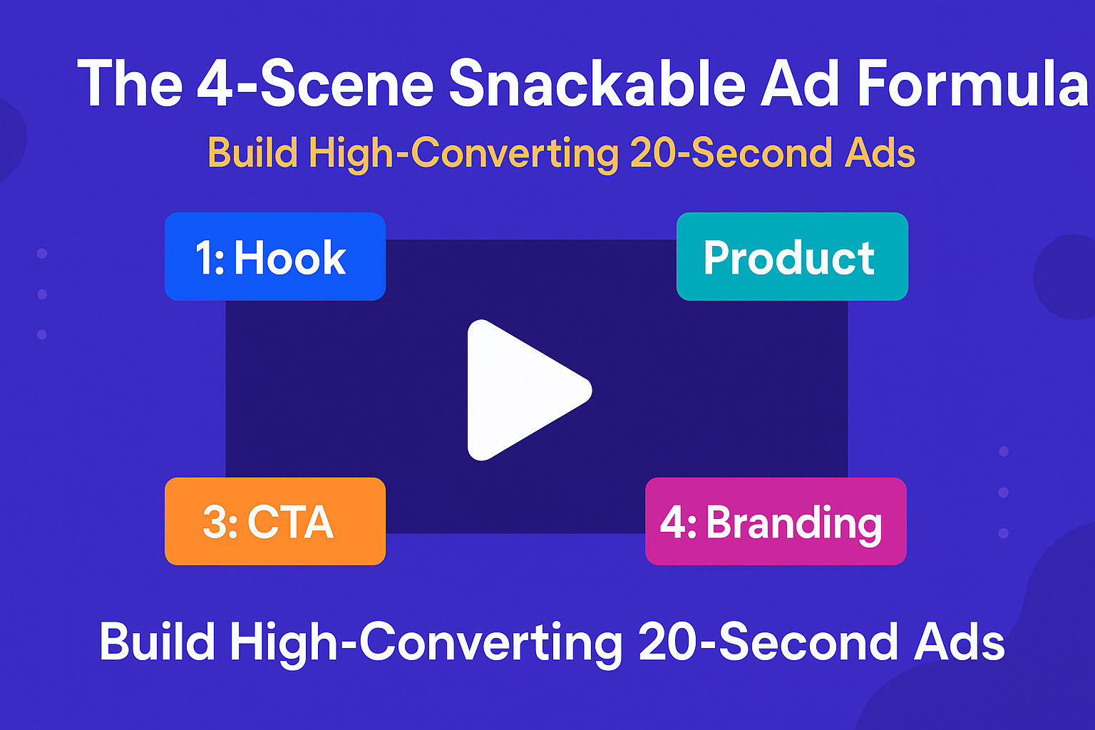
The 4-Scene Snackable Ad Formula (Pixelplot Version)
Here’s the exact structure Pixelplot is built around:
- Scene 1 (5s): Hook — Video
A 5-second scroll-stopper. This is the only moving-video scene in the ad. - Scene 2 (5s): Product — Static Banner
A clean, readable banner that explains what the product is and why it matters. - Scene 3 (5s): CTA — Static Banner
A banner that tells the viewer exactly what to do next (and why they should do it now). - Scene 4 (5s): Branding (Optional) — Programmatic Banner
A consistent end card built from your text + colors (not AI-generated imagery).
You can keep it for recall—or turn it off and end on the CTA banner instead.
This makes snackables fast to produce and fast to test: each scene has one job, and you can generate versions per scene without blowing up the whole creative.
Scene 1 (Hook Video): Stop the Scroll in Under 2 Seconds
Goal: earn attention, not explain everything.
Your hook scene is a 5-second video. It has one job: make the viewer stay long enough to see Scene 2. If Scene 1 doesn’t land, it doesn’t matter how good your product is.
Hook Framework A: The Pain Mirror (Most Reliable)
Say the thing your audience is already thinking.
- “Still doing [bad solution] and hoping for results?”
- “If you’re [persona], this is costing you money/time/sanity.”
Hook video text ideas:
- “Still guessing your ad creative?”
- “Your product page isn’t a video.”
- “Stop wasting budget on one ‘perfect’ ad.”
Voiceover examples (short + direct):
- “Most teams lose money because they test too few hooks.”
- “If your creative process is slow, your growth will be slow.”
When this works best: performance marketing audiences, founders, agencies, eCom teams—anyone who feels the pain today.
Hook Framework B: The Bold Outcome (High-CTR When True)
Lead with a result, not a feature.
- “Turn X into Y”
- “Get [result] without [friction]”
Hook video text ideas:
- “Turn one URL into a 20-second ad.”
- “Make 10 ad variations before you spend.”
- “Launch creatives in hours, not weeks.”
Voiceover examples:
- “Paste one link. Get a snackable ad you can actually test.”
- “Generate the hook video, banners, and voiceover in one flow.”
When this works best: when your promise is concrete and you can show a simple visual proof.
Hook Framework C: The Pattern Break (Visual First)
Sometimes the hook is the contrast—the unexpected visual or the hard cut.
Pattern breaks you can use:
- Before/after flash
- “This vs that” (messy vs clean)
- Rapid zoom on the problem
- A “wait, what?” visual moment
Text overlay examples (minimal):
- “Watch this.”
- “Don’t do this.”
- “Here’s the fix.”
Voiceover examples:
- “Here’s why your ads feel expensive to make.”
- “This is what snackable structure looks like.”
When this works best: TikTok/Reels formats, UGC-style ads, and when you can produce a strong first visual.
Quick Hook Rules (So You Don’t Overwrite)
- Keep on-screen text to one idea, not a paragraph.
- Aim for 6–10 words max on the video overlay.
- Your hook should be understood with sound off.
Pixelplot tip: create 2–3 hook versions. Hooks are your highest-leverage test.
Scene 2 (Product Banner): Make the Promise Idiot-Proof
Goal: answer “what is this and why should I care?” in one glance.
Scene 2 is a static banner. That’s good. Static forces clarity.
The Product Banner Formula
Use this structure:
- Headline: the main benefit/outcome
- Subheadline: specificity or proof hint
- Optional small line: who it’s for / when it’s useful
Examples:
- Headline: “Turn your product URL into a video ad.”
- Subheadline: “Hook video + banners + voiceover. Ready to test.”
- Small line: “Built for TikTok, Reels, and Shorts.”
Or:
- Headline: “Launch more creatives without a studio.”
- Subheadline: “Generate a 20-second snackable from one link.”
What Not to Do in Scene 2
- Don’t list 6 features.
- Don’t use vague fluff (“revolutionary”, “game-changing”).
- Don’t introduce a brand new idea that wasn’t set up in Scene 1.
If the hook creates curiosity, Scene 2 creates clarity.
Scene 3 (CTA Banner): One Action, One Offer, No Confusion
Goal: turn attention into action.
Scene 3 is also a static banner. It should be direct enough that someone can understand the CTA in half a second.
CTA Banner Checklist
- One action (Shop now / Try it / Join beta / Book a demo)
- One reason (what they get after clicking)
- Optional urgency (real, not spammy)
Examples:
| Headline: “Create your first snackable ad.” |
| Subheadline: “Start with one product URL.” |
| CTA: “Join the beta” |
OR
| Headline: “Generate 3 hooks in minutes.” |
| Subheadline: “Test before you spend.” |
| CTA: “Try it now” |
CTA Patterns That Often Win
- “Join beta” + what they can produce today
- “Try it now” + “generate your first ad”
- “Book a demo” + “see your URL turned into a snackable live”
If your CTA is vague, your results will be vague.
Scene 4 (Branding Banner): Programmatic, Clean, Optional
Goal: brand recall (or skip it for performance).
Scene 4 is a programmatic branding banner (text + colors), not an AI-generated image. That’s a feature—your end card stays consistent across every ad.
Typically, this slide includes:
- Brand line (short tagline or positioning)
- URL or handle
- Background color + text color (from your Brand DNA, customizable)
When to Keep Branding ON
- Awareness campaigns
- New brand / low recognition
- Organic posts where recall matters
When to Turn Branding OFF (End on CTA)
- Direct response / performance campaigns
- When your CTA is strong and you want the final frame to push action
In Pixelplot you can toggle this and render both versions, then test which performs better.
Copy and Timing Rules (So Your 5 Seconds Don’t Become 12)
The quickest way to ruin snackable ads is to write like it’s a blog post.
Use these rules:
On-screen text
- Aim for 6–10 words max per scene.
- Headlines should be scannable in under 1 second.
Voiceover
- Keep it to one sentence per scene.
- If you can’t say it in one breath, it’s too long.
Message density
- Scene 1 is the fastest (attention). / HOOK
- Scene 2 is the clearest (meaning). / PRODUCT
- Scene 3 is the simplest (action). / CALL TO ACTION
- Scene 4 is the cleanest (memory). / BRAND
If you try to make one scene do two jobs, the ad gets muddy.
The Versioning System: How to Test 10 Ads Without Making 10 Ads
Here’s the real advantage of scene-based structure: you can create a lot of testable combinations by changing only one piece at a time.
Start with a simple test plan:
- 3 Hook video versions (Scene 1)
- 2 Product banner angles (Scene 2)
- 2 CTA banner offers (Scene 3)
- Branding ON vs OFF (Scene 4)
That’s 3 × 2 × 2 × 2 = 24 possible combinations—without changing your entire creative every time.
A good testing order:
- Test hooks first (highest leverage).
- Keep everything else constant.
- Once a hook wins, test CTAs.
- Then test product angles.
Common Snackable Mistakes (and the Fix)
Mistake: Hook is clever but not relevant.
Fix: hook must mirror a real pain or desire your buyer recognizes instantly.
Mistake: Product banner tries to sell everything.
Fix: one outcome + one proof hint, nothing else.
Mistake: CTA is vague (“Learn more”).
Fix: tell viewers what happens after they click.
Mistake: Branding slide fights the CTA.
Fix: if your goal is performance, end on the CTA and skip branding.
Copy-and-Paste Templates (Fill in the Blanks)
Use these to draft your next ad quickly.
Template 1 — Direct Response (Performance)
Scene 1 (Hook video): “Still struggling with [pain]?”
Scene 2 (Product banner): “[Outcome] in [timeframe] — without [friction].”
Scene 3 (CTA banner): “[CTA]. Get [benefit].”
Scene 4: Branding OFF (end on CTA)
Template 2 — New Brand Awareness
Scene 1: “Meet the new way to [outcome].”
Scene 2: “Here’s how it works: [simple promise].”
Scene 3: “[CTA] to see more.”
Scene 4: Branding ON
Template 3 — Offer/Promo
Scene 1: “Stop scrolling if you want [desire].”
Scene 2: “Get [offer] + [benefit].”
Scene 3: “Claim it now: [CTA].”
Scene 4: Branding optional
Want This Built Automatically? That’s What Pixelplot Does
Pixelplot is built around this exact system:
- Scene 1 is a 5-second hook video
- Scenes 2 and 3 are static banners (product + CTA)
- Scene 4 is a programmatic branding banner you can toggle on/off
- Brand DNA keeps the style and tone consistent across every generation
- You can edit text and regenerate scenes, creating versions without starting over
If you want the step-by-step workflow from product URL → scenes → assets → final render, read:
How Pixelplot Turns a Product URL into a 20-Second Snackable Ad
Build Your First Snackable (Beta)
Bring one product page. Generate three hook videos. Test two CTAs. Decide if branding stays on.
That’s a real creative workflow—without a studio, without a blank page, without a week of back-and-forth.
Join the Pixelplot and generate your first snackable ad from a URL.