
Video Hook Psychology: Stop the Scroll in 1-3 Seconds

Video Hook Psychology: Why Some First Frames Stop the Scroll?
If your short-form ad loses viewers before the message even lands, the problem usually starts in the opening frame, not the offer. This guide breaks down video hook psychology so performance marketers, creative strategists, and founders can redesign the first 1–3 seconds to improve hold rate, thumb-stop rate, and early retention.
Most advice on hooks gives you swipe files and one-liners. That helps, but it does not explain why one first frame interrupts scrolling while another gets filtered out instantly. Here, we’ll map visual novelty, emotion, uncertainty, and relevance to actual feed behavior, then apply that lens to practical audits, platform-specific hook choices, and side-by-side examples you can test without adding production time.
By the end, you’ll know what to put on screen first, how paid hooks differ from organic ones, which hook types work best for cold audiences on TikTok, Reels, and Shorts, and how to run faster first-frame optimization tests using a lightweight audit workflow.
What makes a video hook psychologically effective in the first 1–3 seconds?
A psychologically effective hook earns attention by signaling, almost instantly, that the next second will be more rewarding than the scroll. In feed environments, that usually happens when the opening combines novelty, relevance, emotional charge, and a clear information gap.
People do not evaluate short-form videos like they evaluate a landing page or long-form content. They make a split-second stay-or-skip decision in an environment where attention is scarce and alternatives are endless. That is why the first frame matters so much: it must interrupt a pattern the viewer has already learned to ignore. Research on attention span supports the broader point that modern digital media competes for limited attention, and Nielsen Norman Group’s findings on banner blindness research help explain why predictable visual formats get tuned out.
In practice, the strongest opening shots tend to trigger four attention levers at once:
- Novelty: The frame looks visually different from surrounding content.
- Emotion: A face, reaction, tension, delight, disgust, or surprise creates immediate affect.
- Uncertainty: The viewer needs one more second to resolve what is happening.
- Relevance: The frame reflects a problem, desire, identity, or use case the viewer recognizes.
When one of these is missing, a hook can still work. When all four are absent, the ad usually feels like an ad before it feels worth watching.
A simple way to think about first-frame attention
The fastest audit question is this: Does the first frame create a reason to delay the scroll? If the answer is no, the creative is asking for attention before it has earned it.
That delay often comes from one of three psychological effects:
- Pattern interruption: The visual breaks expected feed conventions.
- Prediction error: The brain notices something that does not fit the expected sequence.
- Reward anticipation: The viewer senses useful, entertaining, or emotionally satisfying information is coming next.
That is why a static logo, polished product beauty shot, or generic lifestyle b-roll often underperforms as an opener. Those assets may be on-brand, but they rarely create enough cognitive friction to pause the thumb.
Why predictable openings fail in feeds
Predictable openings fail because users learn to ignore familiar ad patterns at speed. The more your first frame resembles a template the feed has trained people to dismiss, the lower your odds of holding attention.
This is where many brands confuse clarity with effectiveness. Yes, people should understand what they are seeing. But if the frame is instantly legible and instantly ignorable, clarity does not help. A white-background product packshot, slow logo animation, or stock office handshake may communicate the category, but it does not create urgency to keep watching.
Think with Google has repeatedly emphasized how quickly mobile viewers decide whether content deserves continued attention. In short-form video, that means the first frame should not merely identify the brand. It should create a strong enough signal that the next second is worth buying with attention.
How do scroll-stopping hooks differ between organic short-form content and paid ads?
Scroll-stopping hooks in organic content can lean harder on entertainment, creator personality, and slower payoff, while paid ads need to establish relevance and value much faster. Paid hooks still need to feel native, but they cannot rely on goodwill or an existing audience relationship.
Organic creators often win with a looser opening because the audience has opted into their style. A creator can start with a quirky reaction, a weird statement, or a subtle setup and still get enough patience to land the payoff. Paid ads, especially to cold audiences, do not get that grace period.
For ads, the first frame usually needs to answer at least one of these questions immediately:
- Is this about a problem I care about?
- Is this showing me something unexpected?
- Is this made for someone like me?
- Is there a claim, result, or transformation worth checking?
That creates a useful distinction:
| Hook factor | Organic short-form | Paid social ads |
|---|---|---|
| Primary job | Earn curiosity or entertainment | Earn relevance and attention fast |
| Tolerance for slow setup | Higher | Low |
| Brand presence | Can be subtle | Should appear early, but not dominate frame one |
| Best opener style | Personality-led, trend-adjacent, storytelling | Pain-led, outcome-led, demo-led, disruption-led |
| Success metric emphasis | Engagement, shares, completion | Thumb-stop, 3-second hold, qualified watch-through, conversion support |
The key is not to make paid content look more like an ad. It is to make paid content feel immediately useful, emotionally resonant, or impossible to ignore while still staying native to the platform.
What visual and copy elements should appear in the first frame to improve retention?
The best first frames combine one strong visual idea with one clear meaning cue. In most cases, that means a high-contrast image, an obvious focal point, and short on-screen copy that makes the viewer care right away.
Here are the elements that most consistently improve early retention:
1. A dominant visual subject
The eye needs somewhere obvious to go. That can be a face, a product in use, a painful screenshot, a dramatic before-state, or an unexpected close-up. Avoid busy compositions where the subject blends into the background.
2. Motion or implied motion
Movement catches attention, but the type of movement matters. Sudden handheld framing, a bite, a spill, a gesture toward camera, or a screen interaction tends to work better than generic cinematic drift.
3. On-screen copy with immediate stakes
Your text should raise the value of the next second. Strong examples include:
- Pain point: “Still editing these by hand?”
- Outcome: “How we cut CAC with one creative change”
- Contrarian claim: “This ad format beat our polished UGC”
- Specificity: “3 hook tests that lifted hold rate”
Weak examples are vague and self-referential, like “Welcome back,” “Meet our brand,” or “Try this today” with no context.
4. Native framing and human context
Even in product-led ads, the first frame tends to perform better when it feels used, held, worn, clicked, tasted, or reacted to by a person. Human context increases relevance and makes the asset feel less like a display ad.
5. Legibility on a small screen
If your first-frame text cannot be read in under a second on mobile, it is not helping. Keep the copy short, large, and high contrast. One bold line usually beats three clever ones.
First-frame checklist
- Can a viewer understand the focal point in under half a second?
- Is there visual contrast against common feed patterns?
- Does the frame imply a problem, payoff, or unanswered question?
- Is the text readable without sound?
- Would this still work if the viewer never saw your caption?
Which hook types work best for cold audiences on TikTok, Reels, and Shorts?
For cold audiences, the best hook types are usually pain-point, surprise demo, bold claim, transformation, and curiosity-gap hooks. These formats work because they create relevance before asking for trust.
Cold traffic does not know your brand, your tone, or your product promise. So your opener must create fast comprehension with low effort. The strongest categories usually look like this:
Pain-point hooks
Start with the frustration, not the solution. This works especially well for SaaS, productivity, wellness, and problem-solving products.
- “If your reporting still starts in spreadsheets, watch this.”
- “Most TikTok ads lose the viewer here.”
- “Still spending hours turning briefs into videos?”
Surprise demo hooks
Show the product doing something visually satisfying or unexpected. This works well for DTC, tools, beauty, food, and gadgets.
- Extreme close-up of the outcome
- Before/after in frame one
- Unexpected use-case reveal
Bold claim hooks
Lead with a testable, specific statement. This works best when the claim is immediately understandable and supported in the next few seconds.
- “This hook doubled our 3-second hold rate.”
- “Our ugliest ad outperformed the polished version.”
Transformation hooks
Show the gap between before and after. This is powerful because the brain quickly tries to resolve how the change happened.
Curiosity-gap hooks
Open with a frame that feels incomplete without the next beat. This can be visual or verbal, but it should not become clickbait. If the reveal is weak, retention collapses after the pause.
Platform nuances
- TikTok: Raw immediacy, creator framing, and stronger pattern interruption often win.
- Instagram Reels: Clean visual hierarchy and lifestyle relevance tend to matter more.
- YouTube Shorts: Intent-driven problem/solution openings can work especially well because viewers often tolerate slightly more explicit framing.
The right move is not to create three completely different ads. It is to adapt the first frame, opening text, and pacing to each feed while keeping the core concept consistent.
A practical first-frame audit framework
The most useful way to improve hooks is to score the opening frame before you edit anything else. A fast audit prevents teams from over-focusing on script tweaks when the real problem is that frame one never earned attention.
Here is the framework I use when reviewing paid short-form creative with teams:
The NERV audit: Novelty, Emotion, Relevance, Void
- Novelty: Does this frame look different from what usually appears in-feed?
- Emotion: Is there an immediate human feeling or reaction?
- Relevance: Will the target viewer recognize this as “for me” right away?
- Void: Is there an information gap that makes the next second necessary?
Score each from 1 to 5. If your first frame scores below 12 total, it probably needs a new opening concept, not just copy polish.
This is the firsthand workflow I keep coming back to because it catches weak openings fast. In internal creative reviews, low-performing ads often fail on two points at once: they are visually familiar and they delay relevance. Teams usually think they need a stronger headline, but the larger issue is that the frame itself does not create enough reason to stay.
Side-by-side creative breakdowns
DTC snack brand: package shot vs. bite close-up
The white-background packaging opener communicated the product clearly, but it looked like paid media immediately. The stronger version opened with an unexpected bite close-up, crumbs in motion, and a bold on-screen claim about protein and taste.
Why the second version worked better:
- It added sensory intensity and implied motion.
- It made the product feel consumed, not displayed.
- It paired a visceral visual with a clear reason to care.
The result was stronger 3-second hold and less thumb-stop loss early in the clip. That pattern is common in food and beverage: experience beats packaging as an opener unless the packaging itself is unusually distinctive.
SaaS AI tool: logo intro vs. pain-point screenshot
The original opening led with a logo animation and broad product category statement. The revised version started on a messy workflow screenshot with a curiosity headline tied to a common pain point.
Why the revised version improved watch-through on cold LinkedIn and YouTube Shorts traffic:
- The viewer could self-identify with the problem instantly.
- The screenshot created context without explanation.
- The headline promised resolution before the product was introduced.
This pattern is especially effective in B2B and SaaS: show the friction first, then introduce the tool as the release.
How can marketers test first-frame optimization without increasing production time?
You can test first-frame optimization quickly by changing only the opening shot, on-screen text, and first second of pacing while keeping the rest of the ad constant. That isolates the hook variable and avoids a full reshoot.
This is one of the highest-leverage creative tests because small opening changes can create large retention differences. You do not need five new ads. You need one ad with multiple opening variants.
Fast testing workflow
- Keep the body of the ad the same. Only swap the first 1–3 seconds.
- Create 3 opening styles. For example: pain-point, surprise demo, bold claim.
- Change the first-frame text separately from the visual. That lets you see whether the image or message is doing the work.
- Review hold rate and early retention first. Do not judge hook performance only by CTR or CPA at low spend.
- Promote the winning opener into more concepts. Once a pattern works, reuse the principle, not just the exact line.
A simple matrix can help:
| Variable | Version A | Version B | Version C |
|---|---|---|---|
| Opening visual | Founder talking head | Pain-point screenshot | Demo close-up |
| On-screen text | Question | Specific claim | Contrarian statement |
| Pacing | Static start | Immediate movement | Jump-cut open |
If you need a broader system for sequencing what comes after the hook, PixelPlot’s 4-scene snackable ad structure is a strong next step. If your team is generating multiple variants quickly, our guide to writing powerful video prompts can help you brief and iterate faster without losing clarity.
Common first-frame mistakes that hurt retention
- Leading with the logo: Brand recognition matters, but logos rarely outperform relevance as frame-one content.
- Using generic beauty shots: A polished frame can still be invisible if it looks familiar.
- Writing vague hook copy: “You need this” is weaker than a specific pain or payoff.
- Overloading the frame: Too many text layers, stickers, or competing subjects reduce comprehension.
- Saving the good part for later: In short-form ads, later often never comes.
A useful rule: if the first frame could belong to almost any brand in your category, it is probably not strong enough.
How to create a better video hook on your next ad
The fastest way to create a better hook is to redesign the opening around one audience tension and one visual disruption. Start with the problem or payoff, then find the most concrete image that makes it instantly legible.
- Choose one audience tension. Frustration, desire, fear of waste, need for speed, social proof, or curiosity.
- Match it to one visual trigger. Face, screenshot, demo, close-up, before/after, reaction.
- Add one line of copy. Make it specific, readable, and useful.
- Remove everything nonessential. If it does not help stop the scroll, cut it.
- Test 3 variants. Keep the rest of the ad fixed.
Once your opener earns attention, the rest of the ad has a chance to do its job. That is also where stronger storytelling systems and more conversion-focused creative strategy start to matter. If you want to build from hook to message to outcome, PixelPlot’s guide to content that converts is the logical follow-up.
Frequently Asked Questions
How long should a video hook be?
Most effective short-form hooks do their main job in the first 1–3 seconds. You can extend the setup slightly, but the viewer should understand the tension, relevance, or curiosity trigger almost immediately.
What is the best first 3 seconds for video ads?
The best first 3 seconds usually combine a visually distinct opening shot with a clear problem, claim, or result. For cold paid traffic, show something specific and relevant before introducing brand details.
Do hooks for TikTok ads work the same on Reels and Shorts?
The underlying psychology is similar, but execution changes by platform. TikTok often rewards raw, creator-style interruption, Reels benefits from cleaner composition, and Shorts can support slightly more explicit problem-solution framing.
Should paid ads look like organic content?
They should feel native to the platform, but not aimlessly imitate organic content. The goal is to borrow the attention patterns of the feed while preserving clear relevance, message control, and conversion intent.
Can first-frame optimization improve retention without changing the full ad?
Yes. In many cases, swapping the opening visual and the first line of on-screen text is enough to change hold rate meaningfully. That makes first-frame optimization one of the fastest creative tests available.
Photo SEO Details
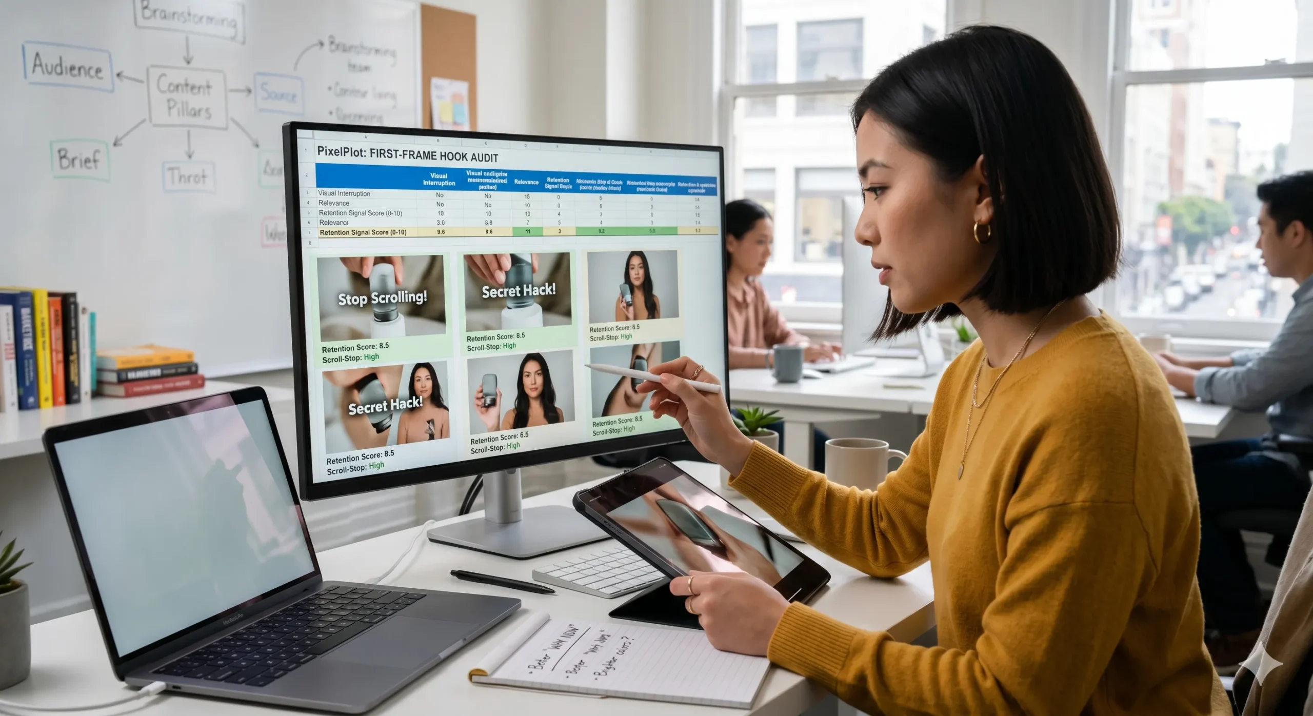
Alt Text: Marketer reviewing short-form video first frames to improve retention and scroll-stopping hooks
Title: First-frame hook audit
Caption: Auditing the first frame helps teams spot why viewers stay or scroll away.
Description: A short-form ad strategist reviews opening-frame variations to identify stronger visual interruption, relevance, and retention signals.
If you’re about to brief or edit a new short-form ad, start by scoring the first frame before you touch the rest of the cut. Apply the framework above to your next creative batch, then continue with PixelPlot’s related strategy content to turn stronger hooks into stronger full-funnel video ads.